Friday, September 30, 2011

October Sketch Challenge

It's time for a new monthly sketch. So without further ado, here is our sketch for October.


October's sketch has been created by our very own Amy Bender. Let's have a look at what the Design Team have created:


Juanna Sia
Kim Kendall
Caroline Hancock
Annette Gearside

Kristie Taylor


Leah Schaeffer


Lisa Kamphuis
Don't forget to get your entries in to me before the end of October. Please send your layouts to scrapbookkitswithjules@gmail.com


All entries will be in with a chance to win a Limited Edition kit from the store.

October Inspiration Challenge...

I found this lovely picture on Pinterest (via Color Seeds) and just couldn't resist. I decided it was perfect for the October Inspiration Challenge. Use it as your inspiration - you can take the colours, picture, design, or any aspect you want, to inspire your creativity.


So, let's see how the Design Team was inspired:


Michelle Wallace


Helen Tilbury
Annette Gearside


Kirsten Casey


Lisa Kamphuis
Petra Offrell

Now, it's your turn. You have until the end of October to get your entry in. Please send your layout to scrapbookkitswithjules@gmail.com
All challenge entries will be in with a chance to win a Limited Edition Kit from the store.

Thursday, September 29, 2011

And The August Winners Are...

Finally, a decision has been made, and I am pleased to announce the winners of the August 1st Sketch and August 15th Sketch: Gillian Hume - 15th August


Samantha - 1st August

Ladies, please send me your mailing address and I will get your prize out to you. You can email me at scrapbookkitswithjules@gmail.com

Thank-you everyone who participated. It is always wonderful to see your creations. And don't forget, you still have one day left to enter the September Challenges. The prize for September is a Limited Edition Kit.

Wednesday, September 28, 2011

Watercolour Fun!

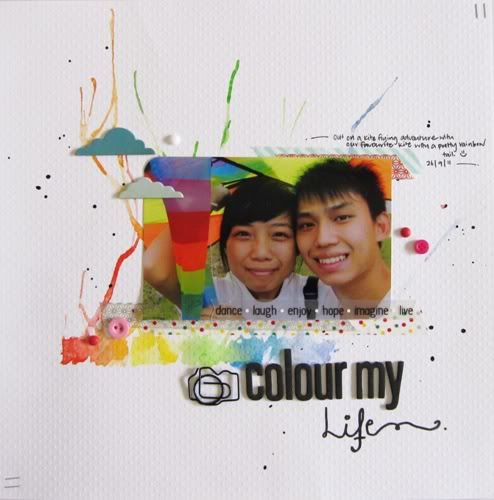
Hello! This is Juanna checking in here with my first blog post! How has your week been so far? Been up to any scrappy “mischief”? Haha!

I do hope that I may be a source of inspiration or motivation for all your scrappers and that we may enjoy this adventure together and learn from one another. So please do leave your comments or feedbacks! They mean a lot to us! (:

Today, I will be sharing with you a simple technique that I have always wanted to give it a go on my project. Just a little background, I love watercolours. I love to paint and draw. These interests probably spark off when my grandmother signed me up for art classes at the age of 7. What would be better than to marry painting/ watercolours with my love for scrapbooking?

So let’s get started shall we? (:

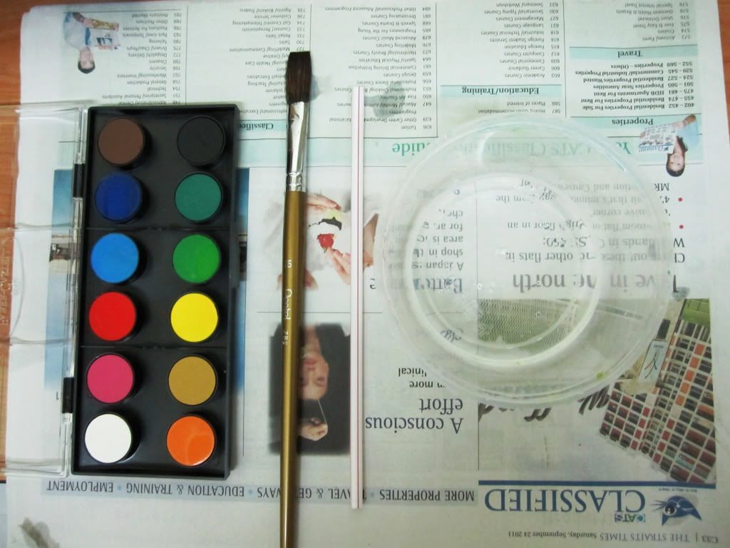
You will need newspapers or your craft sheet to cover your table, so you don’t get paint on them. You will also need some water, your watercolour palette in the colours you desire, a paint brush and a normal drinking straw.

Photobucket

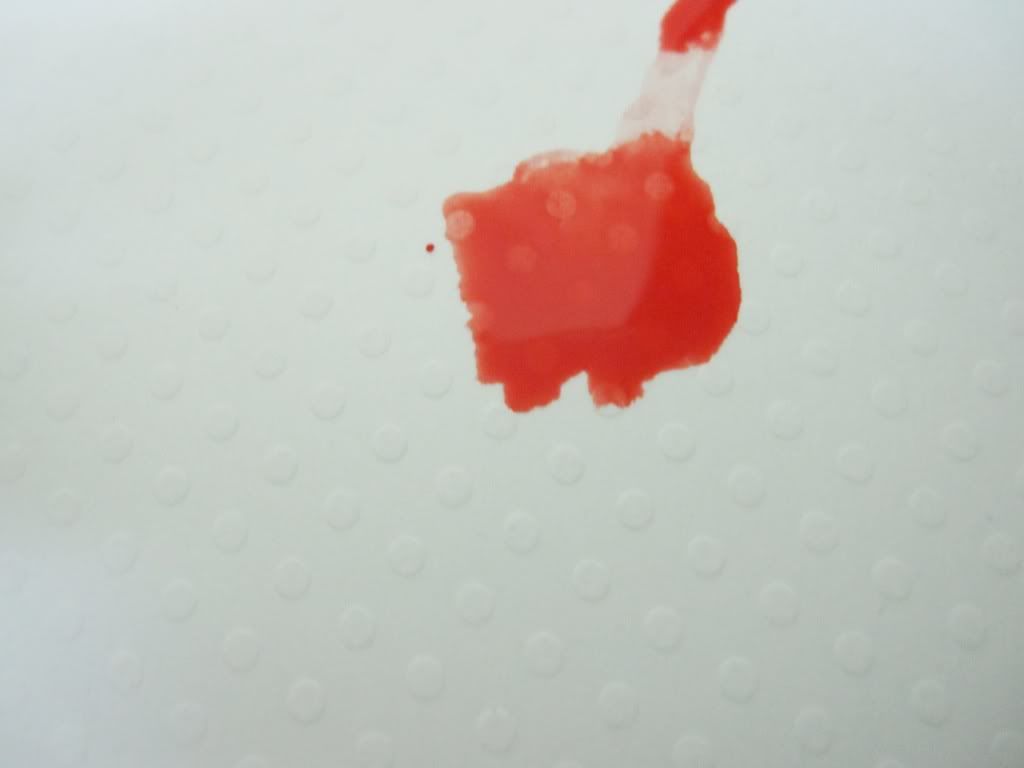
First, wet your paint brush and work on the first colour you would like. Wet your brush until you are able to get that watery colour blob on your cardstock.

Photobucket

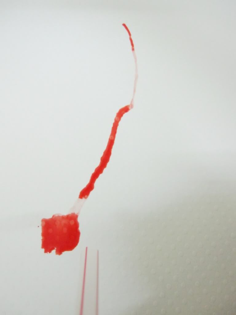
Next, using the straw, blow on the blob until it spreads out like branches. The bigger the blob, the more you get to blow and the longer your “branches”. If you feel that your branches are still not spread out as much as you want it to, you can work your wet brush on the paint colour and gently add a bit more to the original blob or a little on the end of your branch and blow again.

Photobucket

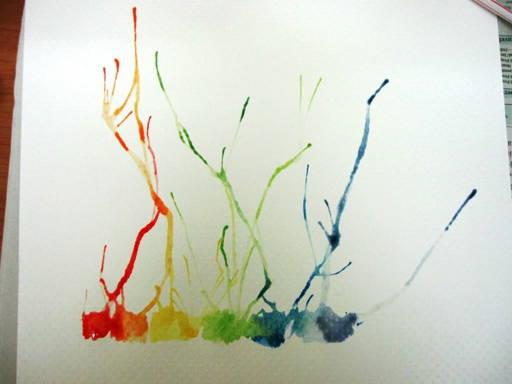
Repeat this process for each of the colour you would like on your project. I did one in rainbow colours. My rainbow watercolour forms the background of my layout.

Photobucket

I splat some black acrylic paint on the layout as well to give it some character. Just to add, I dip a smaller brush with a small tip into some black paint. I positioned my brush vertically on the spot I desire and I tap the peak (topmost part) of the brush to release the paint drops. I did not tap very hard because I wanted smaller paint drops.

I finished the whole layout by adding washi tapes, embellishments, my photo, alphabet thickers and journaling using my trusty black fine pen.
Photobucket

Have fun coming up with your own project using watercolours. And please do share by giving us a link to your project or blog post through the comments. We would love to see it! Thanks for coming by and for your support!

P.S Just something random. I tried to dry my paints using a hair dryer (my heat gun’s not working right now.) and realized it kind of helped me in extending my watercolour “branches”. HAHA! So if you wanted to try, you can use your hair dryer just to experiment. Although I think you will have more control with your “branches” using the straw. (:

Sunday, September 25, 2011

Stamped Focal Images on Layouts


Hello everyone, Leah Schaeffer here today! I hope that everyone has enjoyed their weekend so far! I know I will as I'll have been away to the gorgeous and world famous Napa Valley wine country in sunny California! So beautiful! So while I am enjoying a weekend away I wanted to post for you my layout for the September sketch challenge. 

You will certainly see a lot of stamping from me on my layouts and cards. But since we have put so much money into our stamp collection, we should use them even more often. And a great way to do so it to add more stamping into our layouts.  So I wanted to show here how you can take some of those images and have them as the focal points for your project.


The sketch shows a wonderful banner and though there is a ton of ways to go about that, I thought it would be fun to do shapes instead of a traditional banner. And seeing as I wanted to do something school related, I grabbed my Imaginisce Snag Em' stamps and created this. Using them as focal images and as details around the page.


The primary colors of this layout were softened by the white background and white photo mats. In coloring my images I wanted the colors to remain very bold so I chose to color with markers. Accented some of the stamped images using Glossy Accents and added some bright flowers as well. I also used Glossy Accents to lay down the twine banner string. Since that is such a strong and fast drying adhesive it was a perfect choice to hold down that string.


I hope that this has inspired you to think about adding those great stamped images to layouts, not just as backgrounds and such but as the actual focal points in layouts! Thanks for coming by!

Saturday, September 24, 2011

Challenge Layouts to Share...

We have several challenge layouts to share today. Firstly, we have two entries for the September Sketch Challenge.

Ann Murphy


Gillian Hume

And you have all been very busy, because we also have 3 layouts to share for the September Inspiration Challenge.

Ann Murphy

Amanda

Pamala Casey
Hopefully I haven't missed anyone this time around. But if I have, please send you layout to scrapbookkitswithjules@gmail.com. You still have 6 days to join in the challenge.

Where to start.....

Hello everyone.

Michelle here... **waving madly**

I am most excited as this is my first post on this design team.

Let me first start by tell you a few little secrets about me and how I scrap...
Firstly when I sit down to scrap I often have a sketch in mind to use as a starting block... mind you in the end it looks NOTHING like the sketch.


Secondly I mostly add the photos AFTER I have finished the layout.. though do have a photo in mind when creating the layout.

and

Lastly I love things to have dimension and am a fanatic when I come to hand cutting (just ask my crop classes.. I think I drive them nuts with all the hand cutting I get them to do!). And YES I do own several cutting machine but love the relaxation of cutting things out by hand.. YES I know, I'm nuts!

Okay... enough about me.

When my design team pack came it in the mail filled with all this yummy stuff,  I just couldn't wait to play.
Included in kit was :
Harmonie papers, card stock, various mixed flowers, Creative Imaginations epoxy stickers, mixed ribbons, Bella! chipboard alphabet, Kaiser craft rhinestones and a paper doily.

Here's the layouts I created for you.
Layout 1 -
a fun way to reuse the packaging your kit comes in and paint !

Layout 2 -
cute pleating paper technique with a few hand cut butterflies for a girly touch

Layout 3 -
lots of fun with ink and glimmer mist - don't worry if the colours of you flowers don't match, colour them!

Unfortunately the kits sold out fast...Which I was most chuffed about.

HOWEVER  there are still plenty of other Design Team kits for choose from in the shop.

So why not head over the the shop to see all the rest of the rest of the kits that are available.

So many to choose from they suit every scrap booking style.

Can't wait to show you what I have created with my next Design Team kit.

Stay tuned!


TFL, Michelle x

Saturday, September 17, 2011

Customer Creations...

Would you like to see what our very talented customers have created with one of the Limited Edition kits? The following paper bag mini albums were created by Sandie and Celeste. They are absolutely AMAZING and the full details can be found on Sandie's blog.

These albums were created using the "Timeless" Limited Edition kits available from the store.


I can't thank Sandie and Celeste enough for sharing these beautiful creations with us. I don't often get to see what people create with our kits, so this was such a wonderful treat for me! Don't forget to pop on over to sandie's blog to view the rest of the pages.

And if their are any other customers out there that would like to share their creations, please send an image to me at scrapbookkitswithjules@gmail.com.

Coloring Blocking with Black Mats

Hi everyone!!  My name is Erin and this is my first post with all of you, and I am so happy to be here!!  I would love it if you came by my blog Scraps of Reflections, I have lots of fun tutorials and tips that I post, so I hope to see you pop by soon!! 

Today I want to share with you a fun technique to me, color blocking with black.  I have seen this technique where almost every paper layer is matted in black, and I thought I can do that!!  It is really simple, all you need to do is create layers with your papers (cardstock or patterns) and mat them in black.  If you have fussy cut embellishments you can ink them in black to make it easier rather than cutting them all out again with a black mat.  It really creates a striking fun layout when you are done.  I love the black with all the bright colors, it really makes the whole layout just pop!! 

 
As you can see here, I also triple matted (2 times in black) my main photo to really make it stand out in the layout with all those bright colors.  I also created a journaling space below the picture to help keep the same length from the 3 square photos on the side.
 
 
 I also used fun little letter cut outs and instead of matting them individually I matted them as a block for each word.  This made it not only easier to put on my layout, but it also connected the individual letters together to make the word more unified especially with each letter being a different color.  The black help the letters stand out from the page instead of blend into the background with some many different colors.
 
 
Thanks so much for taking a look and I hope you try this technique some time!!

Enjoy!!
 
Erin R.

Thursday, September 15, 2011

Getting that "Shabby Thang" happening on your Pages!!


Hi there!
Helen here today all the way from Durban, South Africa, by the sea!!
Today I thought I'd give you some guidelines on how to create a SHABBY CHIC layout.
It's really not that difficult but many people shy away from it as they don't know how to go about it or where to start.  


So this is what you need to do!


12 STEPS TO SHABBY CHIC BY HELEN TILBURY

1.  Find your photo.  Once you have that (I use mainly 9 - 13cm photos so that they are not too small but there is still plenty of space around the photo to add all your shabby bits!

2.  Add a strip of patterned paper down the side of your page.  Here mine is 10cm & that's a good measurement to go for as it divides the page into 3rds.  1/3 for your print & 2/3 for your plain cardstock.  That's a pleasing balance on the eye - 3rds are ALWAYS better than halves!

3.  Choose some bits & pieces from your stash - to match your colourscheme.  Doilies are really trendy right now, as are stick pins, and you don't have to spend a fortune on these items.  A friend gave me the doily & the stick-pins I used here are from my sewing stash!

4.  Add a strip of cardstock,co-ordinating print or a border sticker strip so that the top of it sits 4cm above the bottom of your cardstock & it extends from the END of your patterned paper all the way across your page, just like mine does.

5.  Stick down your print and your strip then position your photo to sit on top of the strip just like I've done but DON'T STICK IT DOWN!

6.  Tuck your doily under the top left of your photo (or if you don't have a doily trace around a side-plate or any household item the size of the circle you are after).

7.  Start tucking in all your bits & pieces, making sure to vary your sizes as I have done on my layout.  Glitz Design offer a great selection of precut "What Not's" (yes, that's really what they're called) which make things quick & easy as they all co-ordinate.

8.  If you don't want to buy anything new thought think about using playing cards, tickets, old book or dictionary pages and even downloading images off the internet & printing those out directly onto cardstock -
just cut your card to A4 size & feed through your printer.  There's a great site called"Found in Mom's Basement" that has LOADS  of free vintage images that will be just PERFECT for this type of page!

9.  Now flip your photo over & adhere at the BOTTOM only then carefully lift up each item behind the photo & squeeze out a bit of glue (just make sure it's not the type that will show through the front & no need to use loads!}.  You can even use double-sided tape or glue-dots to get everything stuck down.  Yes - it's a bit tricky but it's worth it!  Use your awl (that pointy thing you use to  make holes in your pages for brads!) to push things further down - tweezers are also a good option but I work better with my awl :)

10.  Don't worry if everything is not stuck down completely.  IT DOESN'T MATTER!  You're going for the shabby look remember?!  So if you have some corners up it just adds to the 3D layered effect.

11.  Add a strip of ribbon along the bottom of your photo (layered slightly over the border strip as you can see on my page) then use some little alphabet stickers to spell out your title.

12.  Almost there!  Lastly you need to add a few bits & bobs around your photo to soften the edges.  Webster's Pages have beautiful vintagey looking flower sprays that look lovely but any flowers will do!  Butterflies are always a good option & if you fold their wings up a bit they look even better.  You can buy them ready made or use a punch to punch them out of your offcuts.  Add in your journaling, handwritten or printed using your pc & printer & that's it.  You're done!

If you would like to see close-up shots of this page you can find it here on my blog.

If this inspires you to try your hand at a SHABBY CHIC layout then link up to THIS POST right here so I can take a look at your pages!

I hope you enjoyed my step-by-step tutorial & will try out a SHABBY CHIC page soon.

WARNING - They are addictive!!


Wednesday, September 14, 2011

Hi there! I am Rebekkah and this is my first post too ! I am so excited to be a part of a DT team that have all such differing and inspiring styles so thanks for having me !!

So are we all inspired by the Sept Colours and pallete.. or is that plate?? he he.

I KNOW i was when i saw it and created my layout for September with the colours in mind.. I love vintage colours at the best of times and my inner shabby chicness came out, so i just went with it.

When i think of vintage - i think of prettiness and softness. I think of soft muted colours and pretty papers, and flowers and spring ! When this is applied to scrapbooking - it means FUN ! It means layering with pretty embellishments, papers and mists, thoughtful photos, children and love.

For this one Joy, i have used the colours that were in the pallete as my complimentary colours. That is colours that compliment each other .. In this case, the muted pink the light blue the white and darker pink and the darker blue. I have repeated these colours for effect and for consistency on the layout. I have used a large photo to empahasize the dramatic effect of my daughter Trinity in posed thought. I have also used misting to add softness to the photo as well as the prima floral bling. A Jenni Bowlin flower appears in the corner as i love butterflies and its a little ode to her as she loves to chase them..
I hope you like what i have done with the photo and hope you can take away at least a technique or two, scrapbooking i feel is all about sharing - sharing the memories and your ideas with others..


In this September Layout, i have misted yet again.. (see a re ocurring theme yet- lol?) this time i have used a mask, but i often use doilies and lace patterned paper, think KI Memories or Creative Imaginations, over and over again.. i love shapes especially..but for this it was a mask.


I have used my photo again - i liked this photo so much i have done 3 layuots so far using it, lol. I figure if you on a good thing.. the flowers at the top of the corner of the photo on the left are actually coloured rubons  i had lying around and i love the effect. I have an addiction to my friend Charmanes lollipop flowers at the moment, and my friend Sues home made buttons. I like the personal touches these add to a layout and its something unique as well. I am starting to include quotes on my layouts now, as i feel it describes the mood i want to convey sometimes better than i can journal. I love to write in general so sometimes i will come up with a quote or two of my own, and i am starting a file with them now, so maybe if Jules will let me we can use one later on.. I just wanted to tell you about the above layouts little journey as well and what i was thinking of when i did the layout. The one above, the photo was taken at the zoo. Shes looking pensive as shes trying to look at a closure, where there were a few people. Constantly i look at my daughter at these times and think of how hard she was to get here at all and how blessed my partner and i are to have her, even if she is a little devil at times..he he.. I just know that when i look at her i feel immensly proud as he is, that she is becoming a nice little girl and is quite considerate of people and the things around her, as thats the quality that i love most in my partner and i am glad she has inherited his nature.

Maybe you can try this when doing your next layout, think about the things that matter the most to you and really try to capture the feeling you want to remember in 20 years time, rather than just jotting down the memory to record the layout.

Thanks for reading if you got this far..
Rebekkah xxx

Technical Error No. 2!!!

Yes, I know! I'm on a roll today, lol! Oh well, these things happen (usually because someone lets me near a computer!!!). I have found two more layouts for the 15th August sketch. This means I'll be giving out another RAK. Stay tuned...winners announced in a couple of days.

Pam Casey


Gillian Hume

Technical Error!!!

Due to a technical error (namely me and a computer), we have found several more entries for the 1st August sketch challenge. Guess what this means? I get to give away a RAK!!! Yay!!! Here are the entries and I will announce a winner in a couple of days.


Linda


Gillian Hume
Amanda

Pam Casey

Sunday, September 11, 2011

Challenge Layouts to Share...

My apologies that these have been posted so late. Life has been a little crazy and hectic since I broke my finger. The doctor says the swelling should disappear in a few months (oh, joy!!!). But I've finally managed to share these layouts from our August and September challenges. Rita Rusello - September Inspiration Challenge
Amanda Taylor - August 1st Sketch
Amanda Taylor - 15th August Sketch
Lynn Shaffer - 15th August Sketch


Ladies, thank-you so much for participating. I really enjoy seeing what amazing creations you can create with our sketches. These are fantastic, and I just love the colour combinations that you have used.


Unfortunately, due to the lack of entries, there will be no RAK awarded for our August sketches. So, come on everyone, let's see what you can do with out September Sketch and Inspiration challenges!!! There's still time - it doesn't close until the end of the month.