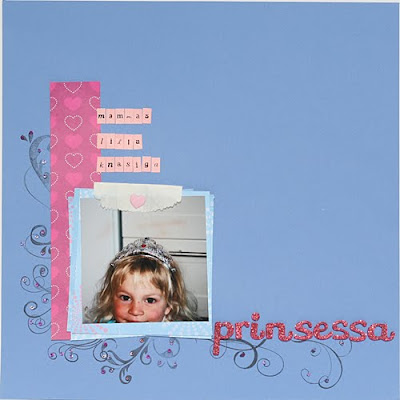
This is the original layout:

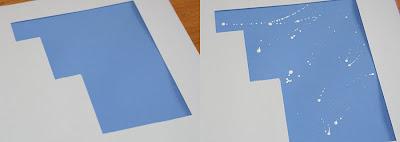
I wanted to add some paint stains but I did not want to get paint on the photo and decorations so I made myself a simple mask:

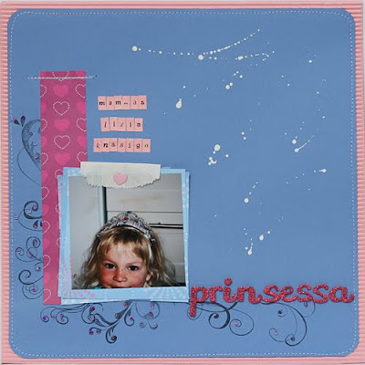
I then cut down the size of the page and rounded the corners, added a frame , moved the mini alphas and added some machine stitching. I like it so much better dressed up like this:
 What do you think?


4 comments:
Awesome idea!! TFS! I think it looks great!
Petra, that is so clever. I've never thought to cover it with a paper template then apply the splatters. I've always worked in the reverse order, which doesn't always work. Must try this next time. Thanks for sharing.
Petra that is a fabulous idea very clever will be giving that ago
great idea! gonna help me out alot when i work with paints, especially the splatting ;p
Post a Comment